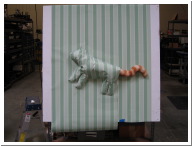
 IMG_1161.JPG |
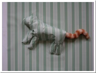 IMG_1162.JPG |
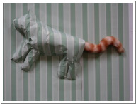 IMG_1163.JPG |
| Friday's cat with clearer definition on head, legs | Friday's cat with clearer definition on head, legs | Friday's cat with clearer definition on head, legs |
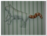 IMG_1165.JPG |
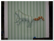 IMG_1166.JPG |
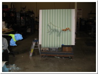 IMG_1167.JPG |
| Friday's cat with clearer definition on head, legs-and Flash photography | Friday's cat with clearer definition on head, legs-and Flash photography | Friday's cat with clearer definition on head, legs-and Flash photography |
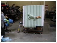 IMG_1168.JPG |
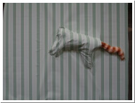 IMG_1148.JPG |
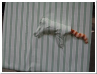 IMG_1149.JPG |
| Friday's cat with clearer definition on head, legs- no Flash | Thursday's cat | Thursday's cat |
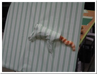 IMG_1150.JPG |
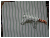 IMG_1151.JPG |
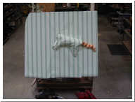 IMG_1152.JPG |
| Thursday's cat | Thursday's cat | Thursday's cat |
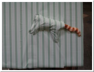 IMG_1153.JPG |
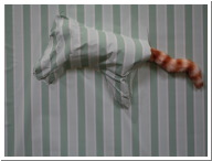 IMG_1154.JPG |
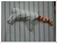 IMG_1155.JPG |
| Thursday's cat | Thursday's cat | Thursday's cat |
 IMG_1156.JPG |
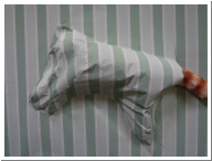 IMG_1157.JPG |
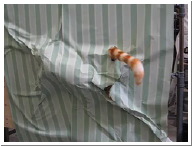 cattail1.MOV |
| Thursday's cat | Thursday's cat | Cat tail movement test 1 |
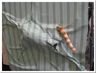 cattail2.MOV |
 IMG_1122.JPG |
 IMG_1124.JPG |
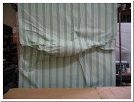
| Cat tail movement test 2 | Prone position | Prone position w/ flash |
 IMG_1125.JPG |
 IMG_1126.JPG |
 IMG_1127.JPG |
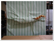
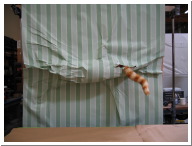
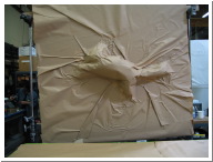
| Prone Position w/ exposed tail | Prone Position w/ exposed tail | Vertical position w/ brown paper |
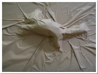 IMG_1128.JPG |
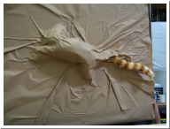 IMG_1129.JPG |
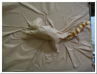 IMG_1130.JPG |
| Vertical position w/ brown paper | Vertical position w/ brown paper, tail exposed | Vertical position w/ brown paper, tail exposed |
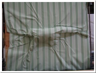 IMG_1131.JPG |
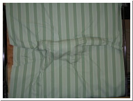 IMG_1132.JPG |
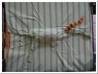 IMG_1133.JPG |
| All Fours position | All fours position w/ flash | All Fours position w/ tail exposed |
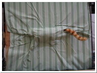 IMG_1134.JPG |
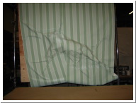 IMG_1135.JPG |
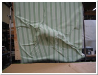 IMG_1136.JPG |
| All Fours position w/tail exposed | Vertical position | Vertical position w/ flash |
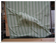 IMG_1137.JPG |
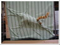 IMG_1138.JPG |
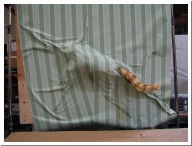 IMG_1139.JPG |
| Vertical position w/ flash | Vertical position w/exposed tail | Vertical position w/exposed tail |